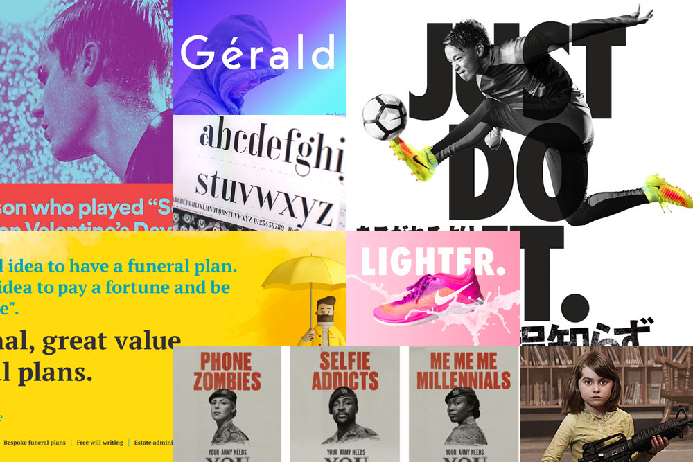
Another year is upon us and, as we reflect on the previous year, it’s also a good time to look at what trends might be the biggest influencers in our work in 2019. Continuing where we left the last 12 months, and perhaps even the 12 months before that, it seems that bold colours, clean text, and pushing the creative boundaries are all the things that we should be looking to in the coming year.
Kiss
Gradients and duotones set to continue to rise
The king of the music streaming services has also been pretty effective in the design of its advertising. Their highly effective use of gradient and duotone combinations, while not completely original, are going to help continue a trend that has been growing for a while. Duotone fades with bright colour palettes, combined with the right imagery, gives a visual impact that’s not easily avoided. A fun approach to the messaging also helps.
So, okay, by the end of 2019 or early 2020 we might all get a little bored of this approach, but for now it’s something to be embraced.
Strip down the visual, increase the impact
Sometimes it’s worth stripping down the concept of a design, so that you’re left with only the most integral functional aspects intact. Be fussy, be bold, be brave, and let the most most important elements speak for themselves.
This could work as a black and white visual with a splash of colour, like the Nike adverts, or it could be a one-colour approach that just gets you noticed. Either approach works, but especially if you take the same approach to the messaging too. Why over complicate things, when the stripped-down, straight-to-the-point approach works so well.
Marry
Make it simple, but significant
In Bauhaus, we trust. And so we bloody well should. Now while Bauhaus has never really gone away, as such, 2019 is the centenary of the legendary German design school, which makes it the perfect time for people to revisit the aesthetic to find fresh inspiration and new angles for design thinking, especially the principles of composition, colour theory, and craftsmanship. Good design should quintessentially be Bauhaus inspired, with their geometric designs and clean, clear construction. Regardless of whether you’re designing a advert or a website, it’s always an advantage if anyone can read your lettering with minimum fuss.
Clean modernist fonts are the order of the day, and to help with this five beautiful alphabets have been meticulously completed by Adobe and a new generation of designers, and are available exclusively to Creative Cloud members. https://adobehiddentreasures.com
Space is the breath of art
In design, white space is often referred to as negative space. But why be so negative? We should embrace the space, and use it cleverly. We shouldn’t feel like we have to fill every millimetre of the design with information. Some of the best examples of recent advertising has utilised the space in thought-provoking ways with simple vector graphics, bold colours, and invoking headlines.
Avoid
Personality, what personality?
This isn’t new for 2019, and I’m certain that this is going to be a problem ad infinitum, but you should always try to avoid clichés. It really doesn’t matter if it’s the headline for a new social media campaign, or a stock image which is being utilised for an advert, let’s not rely on the tried and tested go-to routes. Instead, let’s have a bit of fun and play with the clichés by subverting them. Not everyone is going to get it, some people may even hate it, but you’re bound to get noticed and get your audience talking, and that’s always a good thing, right?

